Names, Not Noise: Designing Closing Credits That Hold the Room

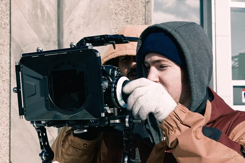
Photo: Basile Morin, CC BY 4.0, via Wikimedia Commons
Closing credits have a reputation problem. In plenty of independent films they are the bit where the money, time and patience have already run out. A scroll of names gets dropped in at the last minute, set in whatever font the edit suite had open, and sent to the render queue. We have done it too. But at Redcat Studios we have started treating the closing sequence as a design job in its own right — not because credits are precious, but because they are the last thing an audience sees before they decide what the film was.
The credits are still the film
A few years ago, the credits were a functional crawl. Now they are part of the mood. On a festival screen they play while people gather coats; on a streaming platform they sit next to an autoplay countdown; at a community screening they are the moment the room works out whether to clap. That is three different design contexts, and all of them are real. If the type is too small, the names vanish. If the type is too busy, the film’s ending gets trampled. If the sequence is too long, the audience starts checking phones. The final ten seconds have to do a job.
Start with the feeling, not the font
The first question we ask on a Redcat project is not ‘what typeface?’ It is ‘what should the room feel like when the last card disappears?’ For a recent short documentary, the answer was quiet gratitude. For a comedy pilot, it was a gentle release of tension. For a client film, it was confidence without smugness. Once you know the feeling, the design choices get narrower. A slow fade and a single line of type will do more for a quiet film than an animated logo. A bright end card can undo a hard-won final shot. The font is the last decision, not the first.
Test on the worst screen you can find
This is the unglamorous part, and it is where most credit sequences fall over. We test on a calibrated monitor, then on a five-year-old TV in the studio, then on a phone held at arm’s length. We also borrow a projector when we can and screen the sequence in a room with the lights half up, because that is closer to a village hall than a grading suite. Names need to be legible at a glance, not studied. As a rough guide, we keep the main credit type large enough to read from the back of a small cinema, and we avoid thin weights that disappear on a phone. Contrast matters more than elegance. If a name cannot be read in the time it is on screen, the design has failed, however nice the kerning looks.
Balance names with mood
Credits are a hierarchy problem. The audience needs to find the director, the producer, the cast and the key crew without reading every line. We group names in blocks, keep job titles smaller than names, and resist the urge to give every role its own card. A long scroll can feel generous; a long scroll with no rhythm feels like a spreadsheet. We usually storyboard the sequence as a series of holds rather than a single speed. The first card gets a beat longer, the middle moves, and the last card holds. That rhythm does more for the ending than any animated flourish.
Decide what the final ten seconds are for
Some films end on a dedication. Some end on a logo. Some end on a piece of music that needs to finish. The mistake is trying to do all three. On a recent Redcat documentary short, we had 140 names, a 45-second music cue and no budget for a credit designer. We cut the scroll to 55 names, moved the rest to a website QR card, and spent the saved time on a final ten-second sequence: a slow blackout, one line of thanks, then the studio cat logo. At the test screening, nobody clapped the logo. That was fine. The room stayed quiet until the lights came up, which was the point.
A practical checklist for UK filmmakers
- Watch the sequence on a phone, a TV and a projector before you sign it off.
- Keep the type large enough to read at a glance; avoid hairline weights.
- Check contrast in a bright room, not just a dark one.
- Group names by role and keep the hierarchy obvious.
- Give the first and last cards a longer hold than the middle.
- Cut any credit that nobody needs; put the rest online.
- Make sure the final card matches the feeling of the film, not the studio’s showreel.
- Export a textless version and a clean end card for festivals and press.
- Check music length against the sequence; do not let a cue get chopped.
- Watch it with an audience before you lock it.
None of this requires a big budget. It requires deciding that the last ten seconds are part of the film. At Redcat Studios, that has become a small ritual: we watch the credits on the worst screen in the building, argue about one line of type, and then let the sequence do its quiet work. The names matter. The feeling matters too.