Small Enough to Squint At: Designing a Studio Logo for the Feed, Not the Boardroom

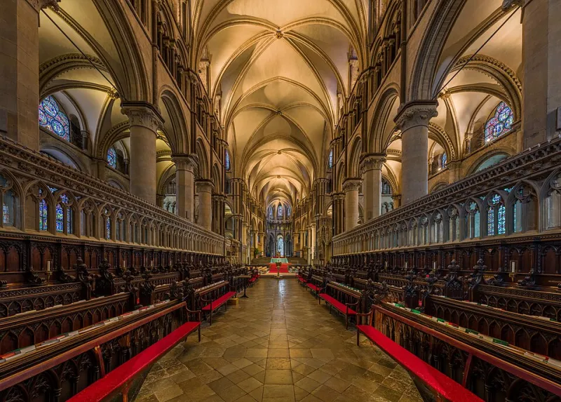
Photo: Eric Ravilious, Public domain, via Wikimedia Commons
Every studio logo gets its first outing on a screen that flatters it. Ours arrived on a pitch deck: generous margins, a big red cat shape, the kind of slide you could read from the back of a meeting room. Then the real world got involved.
The first warning shot came from a social avatar. At 400 pixels it still had personality. At 64 it looked like a smudge with ears. At 16, as a favicon in a browser tab, it looked like a crumb on the screen. That is the moment a studio mark stops being a piece of design and becomes a piece of infrastructure. It has to work when nobody is looking closely, because most of the time nobody is.
At Redcat Studios we have since turned that embarrassment into a habit: the tiny test. Before a mark goes anywhere near a client deck, a shopfront or a sponsor credit, we put it through a small-scale gauntlet. Here is what we have learned.
The 16-Pixel Reality Check
The first rule is simple: design the mark at the size it will actually be seen. Not the size you hope it will be seen. A favicon is 16 by 16 pixels on many desktop browsers; a social avatar is often a circle cropped out of a square; a sponsor credit at the end of a short film might be on screen for two seconds and no wider than a thumbnail. If the idea only works at 200 pixels, it is not a logo. It is an illustration with a job title.
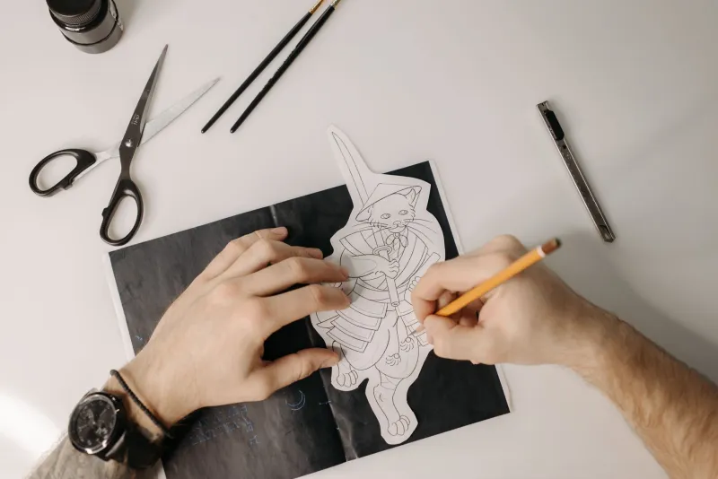
We now draw a 16-pixel grid and redraw the mark inside it. Not as a shrunken copy, but as a separate piece of work. That usually means fewer points, fewer curves, and a lot more decisions about what counts as the essential shape. For our own mark, the ears survived. The whiskers did not. The tail, sadly, became a rumour.
This is not about dumbing down. It is about recognising that a studio mark has two jobs: to be distinctive when it is large, and to be recognisable when it is tiny. Those are different design problems. A good identity system solves both.
One Colour or Nothing
The next test is colour. Many marks are designed in a brand palette and then fall apart the moment they are printed on a tote bag, stamped on an invoice, or placed on a dark photograph. A one-colour version is not a nice-to-have. It is the proof that the shape is doing the work.
We test every mark in solid black, solid white, and a single brand red. If the black version looks like a stain, we go back to the drawing board. If the white version disappears on a mid-grey background, we know the mark is relying on contrast rather than form. If the red version only works on white, it is not ready for the real world.
For small UK creative businesses, this matters more than it sounds. You will end up putting your logo on things you did not plan for: a window sticker, a local sponsor board, a PDF invoice, a QR code card at a market stall. A one-colour mark is the one that survives all of them.
Squinting at Compressed Screens
Screens lie. A logo can look crisp on a calibrated monitor and turn to mush on a phone in a Leeds bus queue, with the brightness down and the signal struggling. We now check marks on the worst screen we can find: an old phone, a cheap laptop, a compressed JPEG sent over WhatsApp.
The test is not scientific. We shrink the mark, screenshot it, send it through a messaging app, and look at it again. If the shape still reads, we are in business. If it turns into a grey blob, we simplify. Compression is a brutal editor. It removes the fine lines first, then the subtle curves, then your confidence.
This is also why we avoid hairline strokes in logos that will live online. A one-pixel line looks elegant in Illustrator and vanishes on a social feed. A slightly heavier stroke looks less refined in a pitch deck and works everywhere else. We usually choose the version that works everywhere else.
The Avatar Is Not a Poster
A social avatar is a crop, not a canvas. Most platforms will take your square image and put a circle on it. If your logo fills the frame edge to edge, the circle will cut off the bits that make it recognisable. We now design avatars with a built-in safe area, and we test them inside a circular mask before they go live.
This is where a lot of small businesses come unstuck. They upload a wide logo, the platform crops the middle, and suddenly the mark is a letter and half a swoosh. The fix is not complicated: make a square version with breathing room, and treat that as the primary asset for social. The wide version can live on the website and in email signatures.
What We Changed
Our own mark came out of this process leaner. The cat is still a cat, but it is built from fewer shapes. The wordmark has a little more space around it. The favicon is not a miniature of the full logo; it is a simplified badge that works at 16 pixels. We also built a tiny sponsor-credit lockup for film end cards, because a logo that looks good on a website can look like a rash at the end of a documentary.
None of this is glamorous. It is the unglamorous part of design that makes the glamorous part possible. A mark that survives the feed gives you room to be ambitious everywhere else.
A Small Checklist for Small Studios
If you are sizing up your own logo, start here. Test it at 16 pixels, 32 pixels, and 64 pixels. Test it in one colour. Test it on a dark background and a light one. Test it inside a circle. Test it as a compressed screenshot on a phone. Ask someone who has never seen it to describe it after a two-second glance. If they say “a red shape”, you have work to do. If they say “the cat thing”, you are close.
The best studio marks are not the ones that look most impressive in the boardroom. They are the ones that still say something when they are the size of a full stop. That is the test we keep coming back to, and it has made our work better at every size since.