Three Metres in the Drizzle: Designing Film Key Art for Bus Shelters, Not Monitors
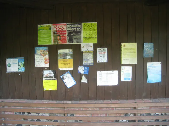
Photo: Sandy B , CC BY-SA 2.0, via Wikimedia Commons
Every independent film we have worked with has the same first instinct: design the poster for the screen. Something subtle, something with a bit of negative space, something that looks gorgeous on a calibrated monitor at 100 per cent. Then it goes up on a bus shelter on a wet Tuesday in November and it looks like a grey rectangle with a smudge on it.
For our most recent key art job, a short shot on 16mm in South Yorkshire, we reversed the order. The poster was designed for a six-sheet before a single frame of the film was graded. It was the right call, and it changed almost everything about how the artwork ended up looking. Here is how we got there.
Design for the worst viewing condition, not the best
A bus shelter panel is roughly 1.8 metres tall by 1.2 metres wide, give or take a few millimetres depending on the contractor, and it sits behind glass that will be rained on, fingerprinted, and occasionally used as a leaning post. It is also usually unlit, which means for about sixteen hours a day it is being seen in whatever light the street provides.
That is the brief. Not the festival programme, not the Instagram grid. Once you accept that the shelter is the primary venue and everything else is a derivative, the design decisions stop being a matter of taste and start being a matter of engineering.
The three-metre test
The first proper review we do on any poster is a printout at roughly A4, taped to a wall, viewed from three metres away. Three metres is roughly the distance from the pavement to the middle of a shelter panel, and it is unforgiving.
What survives: a face, a silhouette, one strong shape, three or four words. What dies: thin script typefaces, two-line titles under twelve words, anything with a drop shadow doing structural work, and every piece of detail you spent an afternoon on. We print in greyscale too, because the third test is a squint — if the composition collapses into an undifferentiated grey mush when you half-close your eyes, the value structure is wrong regardless of hue.
On this job we went through nine rounds before the wall test passed. The winning version had the title at roughly a fifth of the panel height, a single figure at the left third, and nothing else. Version four, which we all loved, had a beautiful debossed texture across the sky. At three metres it was invisible. At three metres in the rain it was a smudge.
Colour that survives sodium and slate
British street lighting has been mid-retrofit for years, which means the same poster may be seen under old orange sodium lamps, newer white LED, and a good deal of plain overcast daylight. That is three very different colour temperatures, and art that only works in one of them is art that will fail somewhere.
The specific hazards we design around: deep blues and purples go near-black under sodium light, so a moody midnight-blue poster becomes a void. Reds and oranges can fluoresce and blow out under warm lamps. Mid-greys disappear against wet tarmac and grey skies, which is ninety per cent of the background in this country. High-saturation colour on a dark ground tends to vibrate unpleasantly at distance.
What we ended up with was a limited palette — a warm bone white, a dirty amber, and one cool green reserved entirely for the title against the warmer background. Values were pushed apart deliberately, so the panel reads at a glance even in flat light. We checked it by taking the file out at seven in the morning and again at half eight at night and photographing a proof panel in situ before signing anything off. If you can only do one real-world check, do the evening one. Daylight is generous; street lighting is not.
Glass, frames and the thirty millimetres you will lose
Two things eat your layout in the real world. The first is the frame: the metal or plastic surround of a shelter panel covers the outer edge, and how much varies by contractor, so we keep a 40mm safe margin inside the trim on top of the print bleed. Anything important within 30mm of the edge is at risk.
A common error on independent film posters is a credit block right at the bottom edge. On a shelter it is either clipped by the frame, obscured by a puddle of condensation sitting in the bottom channel, or simply below the eye line of anyone walking past. Move it up. Give it room.
The second is reflection. Glass over a dark image at night becomes a mirror. If your design relies on a subtle dark-on-dark gradient, at 8pm it will be a picture of a Ford Fiesta and half a kebab shop. Light backgrounds and clear figure-ground separation are not timid choices — they are the ones that survive.
Type, credit blocks and the small print
A title set in a high-contrast serif with fine hairlines will lose those hairlines in print and lose them again behind glass. We use a bold or black weight, generous letter spacing, and we test the title at the actual physical size by printing just that element on A3 and pinning it up outside the studio door.
Credit blocks are a contractual and practical nuisance. At six-sheet size, the billing block ends up around 3mm tall per line. That is legible if a person stands close, and completely absent from three metres, which is fine — nobody reads the block from the pavement. What matters is that it does not create visual noise. We set it in a clean sans at a flat weight, keep the logo lockups on one baseline, and resist the urge to add a fifth production company.
The boring print specifications
Useful things we have learned to set up before the first export: CMYK with a coated stock profile agreed with the printer, 3mm bleed on every edge, fonts outlined or supplied separately, and a rich black rather than 100 per cent K for large areas of dark. We always ask for a physical proof on the actual substrate — a paper poster and a synthetic one behave differently, and synthetic holds up much better in a damp shelter but shifts colour slightly. Ask your contractor which they use.
And send a layered file plus a flattened PDF with the text still editable in a separate version. You will get a last-minute name change. You always do.
The monitor is a liar
Our final artwork looked slightly clumsy on screen. The amber was warmer than we wanted, the type heavier than felt tasteful, the composition more centred than felt modern. On the panel, in the rain, at three metres, with a van going past, it was the first version anyone actually read.
That is the whole lesson, and it applies well beyond film posters. Design for the place where the work will be seen, then let the beautiful version live on the website.