Nine Lives, One Logo: Giving Our Studio Cat a Personality Without the Cringe
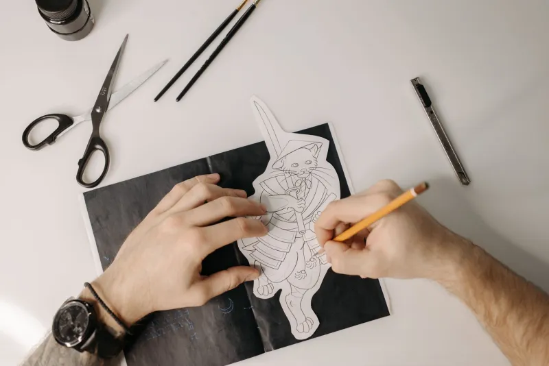
At Redcat Studios, the cat was not part of the plan. We had spent years introducing ourselves with a wordmark, a colour palette and a folder of showreels. Then someone drew a small red cat in the corner of a call sheet — ears too big, tail like a broken comma — and everyone kept looking at it. That is usually how mascots arrive: not from a brand workshop, but from a scrap of paper that refuses to go in the bin.
The brief nobody asked for
We eventually wrote a brief, mostly to stop ourselves from designing something adorable and useless. The rules were simple. The cat had to work at 16 pixels and on an A1 print. It had to feel like a studio cat, not a cereal mascot. It could be charming, but it could not wink at the client while they were signing a contract. And it had to live alongside serious film, photography and design work without turning every page into a fancy-dress party.
That last point mattered most. Our clients include people commissioning documentaries, brand films and editorial photography. They do not need a cartoon animal telling them everything will be fine. They need to know we can hold a camera steady and hit a deadline. A mascot is a signature, not a substitute for competence.
Sketch one: a cat with a clipboard
The first fifty sketches were wrong in useful ways. One cat had a director's megaphone. One had a tiny beret and a light meter. One looked like it had been drawn by a Victorian taxidermist. We kept circling the same problem: the more props we gave the cat, the less it looked like us. A mascot with a clapperboard says film company. A mascot with a camera says photography. A mascot with a pencil says design. We do all three, so the cat had to say none of them too loudly.
We stripped it back. No props. No speech bubble. No jaunty slogan. Just a red cat with a slightly lopsided head, a thick tail and one paw lifting, as if it had just noticed something off-screen. The gesture was the whole personality. It could be curiosity, impatience or the look a cat gives a half-open door. That ambiguity became the point.
The cringe threshold
Every character-led brand has a cringe threshold. Cross it and serious clients start reading your website like a children's book. Stay too far away and the mascot feels like a sticker slapped on a spreadsheet. We found our line by testing the cat in the least playful places: an invoice footer, a location recce sheet, an email signature, a credits slide. If it still felt like a studio mark rather than a joke, it stayed.
We also gave the cat rules. It never speaks. It never gives a thumbs-up. It does not appear on every page. It turns up in idents, social avatars, the odd behind-the-scenes post and the studio door. The work stays centre stage. The cat is the thing you notice on the second look, which is exactly where a mascot should live.
Colour, or why tomato red is a commitment
Red is a difficult colour in the UK. It can read as sale sign, warning label, post box or football shirt. We wanted something warmer than a warning and less shouty than a discount banner. The final palette is a tomato red, a deep charcoal and a paper white. The red is used sparingly: the cat, a rule under a heading, a progress bar. Charcoal does the heavy lifting. White gives everything room to breathe.
We also checked it in British daylight, which is its own design critic. Under grey skies the tomato red still holds; under office fluorescents it does not turn orange; on a phone screen it does not glow like a notification. That sounds fussy, but mascots fall apart in bad light. Ours had to survive a wet Tuesday in a client's reception area.
What we learned about serious clients
The surprise was not that clients liked the cat. It was that they trusted it. A small character gave us a way to be memorable without being loud. It made our invoices feel less like a demand and more like a note from a studio with a personality. It gave our social posts a running visual joke that did not require a copywriter. And it gave us a shorthand for our own taste: curious, a bit scruffy, not too pleased with itself.
For other UK small businesses thinking about character-led branding, our advice is boring but reliable. Start with a gesture, not a costume. Give the character a job and a limit. Test it in the places where you need to look professional. And do not let it become the reason people remember you. Let it be the reason they remember you kindly.
The mascot as a signature
The red cat is still not the logo. It is not on the front of the building in letters a metre high. It is a small mark that says a person made this, and that person has a sense of humour. In a market full of studios with clean grids and confident taglines, that is worth something. Nine lives may be overstating it. One well-behaved cat is enough.