The Noticeboard Is the Screen: Designing an A4 Campaign for a Micro-Budget Short
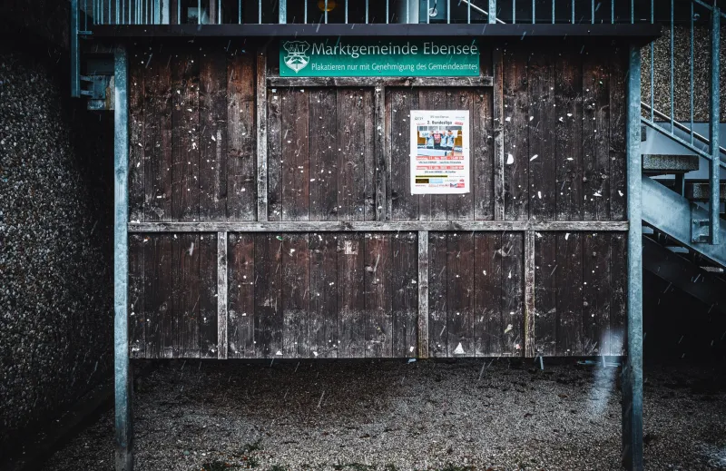
Most film campaigns begin with a poster and end with a feed. Ours began with a question: what if the only place anyone saw the artwork was behind the glass of a parish noticeboard, next to a yoga class and a missing cat? Earlier this year, Redcat Studios made a micro-budget short and decided to promote it without spending a penny on ads. The plan was simple enough: A4 sheets, a stapler, a box of Blue-Tack, and every honest noticeboard we could find in one UK town.
We called it the noticeboard circuit. It was less glamorous than it sounds, and more useful than we expected.
Design for the glass, not the grid
The first thing you realise is that a noticeboard is not a blank canvas. It is a busy, badly lit, slightly damp display surface with its own hierarchy. Your artwork is competing with a coffee morning, a council consultation, a lost dog and a poster for a tribute act. Nobody is standing there to admire your kerning. They are waiting for the library to open or wondering whether the chip shop does gluten-free batter.
So we designed for the glass. That meant high contrast, one clear image and a headline that could be read from two metres away while someone held a shopping bag. We avoided thin fonts, reversed-out type and anything that looked like a film festival laurel. The artwork had to work as a piece of local information first and a film poster second.
At Redcat Studios we usually design for screens, where we can control the light and the size. This was the opposite. The screen was a sheet of A4 behind scratched perspex, in whatever weather the town was having that day.
The A4-first rules we actually kept
We set a few rules and broke almost none of them. The first was: design at A4 from the start. Not a larger poster shrunk down. A4 was the format, so A4 got the full attention. That sounds obvious, but it changes everything. You have less room for credits, less room for logos, less room for the part where someone wants to explain the whole plot.
Our second rule was eight words or fewer for the main headline. The final version read: 'A short film. Village hall. Free. Bring someone.' That was it. The title of the film sat underneath in smaller type, along with a date, a time and a simple URL. We didn't use a QR code as the only route in. QR codes are fine, but they assume a phone, a signal and a person willing to scan something stuck to a noticeboard. A short web address is more forgiving.
Third rule: one image. We used a still from the film that made sense without context, which ruled out the moody close-up of someone staring off-camera. Instead we used a wide shot of the location, because people could recognise the place. Local recognition beats cinematic mystery when your audience is halfway through a bag of chips.
Fourth rule: body text at least 14pt, headline at least 72pt. On a parish board, 14pt is still small. But it is readable if someone steps closer, and it stops the sheet becoming a wall of grey.
Rain, glare and the Blue-Tack problem
We printed on 160gsm paper and laminated every outdoor sheet. That was not a design decision so much as a survival decision. Rain doesn't just make paper soggy; it makes ink run, corners curl and Blue-Tack lose its grip. Laminating also gave us a matte surface, which helped with glare. Glossy A4 behind glass is basically a mirror with a poster hidden somewhere inside it.
We tested each design in the wild before printing the full run. We stuck a proof to a window, stood back and squinted. We looked at it in morning sun, afternoon sun and the flat grey light that British weather specialises in. We asked one person who wasn't involved in the film to tell us what it said. If they couldn't read the date from a normal standing distance, we changed the date.
The Blue-Tack issue was real. Some boards are pin boards, some are behind glass with no access, and some are held together by hope and old staples. We carried our own pins and removable adhesive, but we also asked first. A noticeboard is someone's wall. Covering another notice, using too much tape or leaving a sheet up two weeks after the event is a quick way to get the whole campaign banned from the library foyer.
Talking to people who weren't looking for a film
One of the best things about the noticeboard circuit is that it reaches people who don't read film listings. They are not looking for a short film. They are looking for a table sale or a defibrillator training session. That changes the language.
We stopped saying 'official selection' because it means nothing outside a festival context. We stopped saying 'micro-budget' because it sounds like an apology. We said: 'A short film made here, with people from here. Free screening at the village hall. 78 minutes including a chat.' That last bit mattered. People want to know what they are committing to. A 12-minute film is a low-risk evening out, but only if you tell them it's 12 minutes.
We also put the artwork in places where a film campaign normally wouldn't go: the chip-shop window, the library foyer, the community fridge door and the parish board by the war memorial. Each placement had a different job. The chip-shop window caught people on a Friday evening. The library foyer caught people who had time to read. The fridge door caught people doing something practical. The parish board caught the people who actually organise village life.
The campaign in the wild
We photographed every placement. Not for the aesthetic, though some of them looked brilliant in a scrappy, sun-faded way. We photographed them because placement is data. A sheet that gets moved, covered or taken down within a day tells you something. A sheet that survives three weeks but sits behind a bin tells you something else.
We noted the time of day, the weather and whether the artwork was readable from the pavement. We learned that north-facing windows are kinder than south-facing ones, that condensation is the enemy of paper, and that a noticeboard beside a radiator will curl a laminated sheet like a crisp. We also learned that the best placement is often the one you didn't plan: a library foyer at 10am on a Tuesday, when the same people walk past three times a week.
The campaign didn't go viral. It wasn't meant to. It got a decent turn-out at the village hall, a few new faces, and a handful of conversations that started with 'I saw your poster in the chip shop.' For a micro-budget short in a UK town, that is a result.
What the board taught us
A4 is not a lesser format. It is a local format. It asks you to be clear, brief and useful. It punishes cleverness that only works on a backlit screen. It rewards design that respects the person standing in the rain with a dog on a lead.
We came away with a simple set of rules for any future campaign: design A4 first, test it behind glass, laminate for the weather, use plain English, ask before you stick, and photograph every placement. The noticeboard is not a stepping stone to a bigger campaign. It is the campaign. And if the artwork works there, it will work almost anywhere.