The Invisible Art Department: Designing Subtitles That Survive a Bad Telly
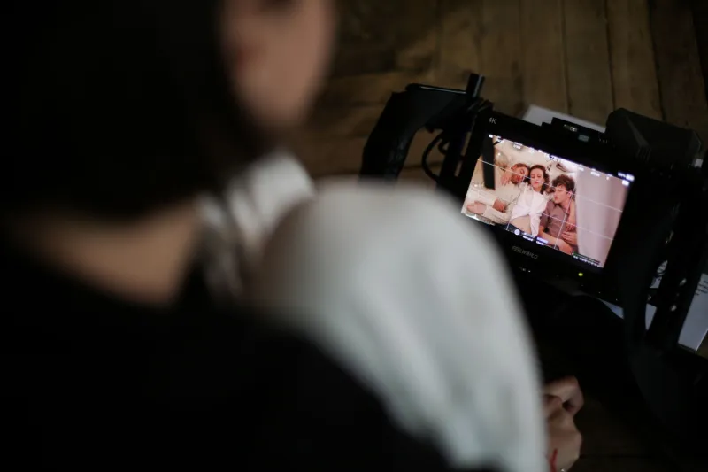
Captions usually arrive at the end of a project like a takeaway you did not order. Someone exports an SRT, someone else checks it on a laptop, and everyone agrees it looks fine. Then the film plays on a friend's old telly in a bright front room, and the subtitles vanish into a pale wall. That was the moment, on a recent Redcat Studios short, when we stopped treating captions as a file format and started treating them as design.
The caption is in the frame, whether you like it or not
A subtitle is not floating in a neutral void. It sits over faces, jumpers, brickwork, rainy windows and whatever else the art department spent three weeks worrying about. If the caption is hard to read, the viewer is no longer watching your film. They are decoding it. That makes captions a visual decision, not just an accessibility box-tick.
We began by looking at the actual shots, not the script. Which scenes had busy backgrounds? Where did white text disappear into a kitchen wall? Which characters wore stripes that made a thin typeface look like a bleep test? We pulled stills into a document and put sample captions over the worst frames. It was humbling. A typeface that looked elegant on a monitor turned to fog on a living-room TV.
Type choices that respect the footage
We settled on a humanist sans-serif with a tall x-height, open apertures and enough weight to survive compression. Nothing condensed, nothing fashionably thin, nothing that looked like a film-poster credit sequence. The caption has to work at speed, often while someone is eating toast and half-watching. Legibility beats personality every time, but that does not mean the result has to look ugly.
We kept lines short, two at most, and avoided splitting phrases across the line break. We also stopped centring every caption by habit. On some shots, a lower-third position sat directly over a character's moving hands. Shifting the caption slightly higher, or giving it a subtle background plate, did more for readability than any font change. The caption became part of the composition rather than a sticker on top of it.
Contrast was the big lesson. Pure white text with a heavy black outline is not automatically the answer. On a low-budget film, a thick outline can look like a 1990s DVD menu. We tested a soft shadow, a semi-transparent rounded plate and a clean white fill with a darker edge. The winner depended on the shot. The rule was simple: if you have to squint, it is wrong.
Timing is a design material too
British slang is brilliant and compact, which makes it a nightmare for subtitle timing. A character can say 'innit' in half a second and carry three layers of meaning. If you flash it on screen for 900 milliseconds, the audience gets the sound but not the attitude. We held slang terms and idiomatic phrases a beat longer, and we never split them from the clause they belong to. 'Mardy' on its own line is not a subtitle. It is an ambush.
We timed to roughly 160 to 180 words per minute, then adjusted by ear. Overlapping dialogue got dashes and, where possible, separate positions. We did not caption every 'um' and 'er' in the performance track, but we did include them where they carried character. The aim was not a transcript. It was a reading experience that matched the rhythm of the film.
Test on the worst screen in the building
The first proper test was a living-room TV viewed from the sofa, then a laptop at a bad angle, then a phone with a cracked screen and a smudge of something unidentifiable. The cracked phone was the useful one. It forced us to check stroke weight, contrast and line length under genuinely hostile conditions. If a caption survives a cracked phone in a grey British November, it will probably survive a cinema.
We also watched with the sound off. That is where audio cues matter. A door slam, a kettle boiling, a bus hissing past in the rain: these are part of the story, and caption users should get them. We kept sound descriptions brief and consistent, and we resisted the urge to over-explain. '[Door slams]' does more than '[Loud door slamming sound in hallway]'.
A checklist you can steal
- Choose one typeface with a tall x-height and test it at half the size you think you need.
- Keep captions to two lines maximum and break at natural clause boundaries.
- Never split British slang from the phrase that gives it meaning.
- Use a background plate or shadow when the footage is busy; avoid heavy outlines by default.
- Time at 160 to 180 words per minute, then hold slang and jokes slightly longer.
- Check contrast in greyscale as well as colour.
- Test on a TV, a laptop and a cracked phone screen.
- Watch with the sound off and add brief audio cues where they matter.
- Use British English spellings, but do not 'correct' dialect in dialogue.
- Deliver both a sidecar subtitle file and a burned-in version if the client needs it.
Captions are part of the film
By the end of the short, the subtitles had their own version history, their own notes and their own small arguments. That felt right. They were not a compliance task bolted on after the colour grade. They were another layer of design, sitting in the same frame as the production design, the costume and the lighting.
For low-budget filmmakers, the good news is that this does not cost much. It costs attention. Start captions earlier, look at them over real footage, and test them on the worst screen you can find. The invisible art department will thank you.