Crisps Under a Clamp Lamp: Designing a Pop-Up Cinema Menu That Belongs in the Room
There is a moment, about twenty minutes before doors, when a pop-up cinema either becomes a room or stays a hall with chairs in it. The projector is focused, the cables are taped, someone is testing the urn. And then there is the table by the door: a stack of paper cups, a tin of biscuits, a cardboard box of crisps. It is easy to treat that table as admin. We didn’t. For our latest micro-budget screening night, we treated the snack menu as part of the set — because, frankly, it is.
Hospitality design is production design by another name. It tells an audience where they are, what kind of evening this is and whether they should relax. A badly photocopied price list says “we ran out of time”. A considered menu says “we thought about you standing here in your coat”. The difference is not money. It is attention.
The menu has a job before the film does
A cinema menu is not a restaurant menu. Nobody is sitting down to study it. They are in a queue, holding a bag, deciding whether they want sugar before a ninety-minute film. The menu has about four seconds to answer three questions: what is there, how much is it, and does any of it contain milk, nuts or gluten? Everything else is decoration.
That sounds obvious, but most pop-up menus fail on the first question because they are laid out like a poster. Big title, decorative border, prices in a column so pale it looks embarrassed. Under a village hall’s fluorescent strip light, it might just about work. Under the warm, dim glow of a screen-side clamp lamp — which is the actual lighting condition — it disappears.
So we designed for the worst light in the room, not the best. That meant testing the menu at 8pm with the main lights off and only the snack table lamp on. We printed three versions: one with a dark background and white type, one with cream stock and black type, and one hand-lettered on a sheet of grey board. The dark version looked the most “cinema”. It was also the hardest to read while moving. The cream version won. It was less romantic, more legible, and it did not turn every crisp packet into a glare.
Type that behaves under a clamp lamp
We settled on a single bold sans-serif for the menu body, set large and ranged left. No centred paragraphs. No tiny small print at the bottom. Prices sat directly after the item, not in a separate column, so the eye did not have to travel across a wobbling table. The heading was hand-lettered in thick marker — not because hand-lettering is trendy, but because it matched the room. A village hall with a tea urn does not need a menu that looks like a hotel bar.
The hand-lettering had a practical benefit too. We could make the letters wide and open, with plenty of space between lines, so the menu still read at arm’s length. We used a black chisel-tip marker on off-white board, then sealed it with a matte fixative so it would not smudge when someone rested a cup against it. Total material cost: under a tenner, plus the board we already had in the studio.
Make the £1 bag of crisps feel intentional
There is a particular British skill in making a modest thing feel like a treat without pretending it is something else. We were not going to write “artisanal hand-cooked potato crisps” about a multipack from the corner shop. That would have been funny for about three seconds and then just annoying. Instead, we leaned into the honesty. The menu said “Crisps — £1” and underneath, in smaller type, “salt, cheese & onion, prawn cocktail”. That was it. No tasting notes.
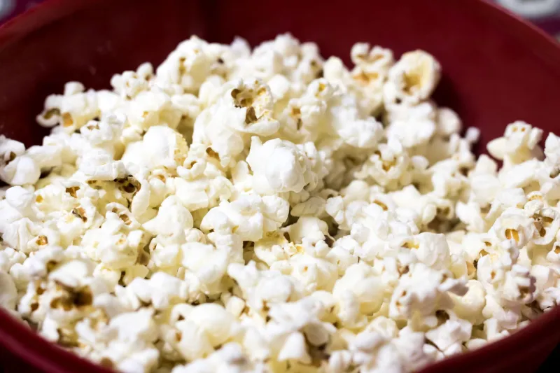
But we did give the crisps a proper place. They went in a woven basket lined with greaseproof paper, not left in the box. The bags were fanned so the colours read from the door. A small hand-lettered sign said “Help yourself to a napkin — the floor is older than all of us.” That line did more work than any price list. It told people we were looking after the room.
The same logic applied to the hot drinks. The urn was already there. We made a small card that said “Tea, coffee, squash — 50p. Bring your cup back if you can.” We had a washing-up bowl behind the table. It was not glamorous. It was hospitality.
The queue is part of the layout
We learned this the hard way at an earlier screening: a menu on the wall behind the table looks lovely until twelve people are standing in front of it. So this time we put the menu on the audience side of the table, angled slightly towards the queue, and we kept the serving area clear. One person poured, one person took money, one person pointed at the allergens card. The menu was not a decoration. It was a traffic plan.
We also printed a separate A4 allergen sheet in larger type and kept it in a clear plastic sleeve on the table. It listed the actual brands we were serving, not generic categories. That is not just good manners; it is the sort of thing that stops a simple night becoming complicated. If you are running a screening with food, check the current UK allergen rules and label honestly. A pretty menu is no excuse for a vague one.
What we would do differently
Next time we would print the menu on thicker stock and drill two holes so it can be cable-tied to the table rather than propped against a biscuit tin. We would also make the hand-lettered heading slightly smaller so it does not compete with the film poster by the door. And we would bring a second lamp — not for atmosphere, but because one clamp lamp creates a shadow exactly where the prices are.
None of this is grand design. It is the sort of work that disappears when it is done well. Someone walks in, reads the menu, buys a tea, finds a seat and forgets the table entirely. That is the point. The snack bar is part of the set. It should hold the evening together without asking for a round of applause.